Along with our monthly support for fixing bugs, we continue to make several small improvements to our website. Here are the ones for fall 2015.
Routes & Places and Activities
- We improved Routes & Places by adding alternative title options. Many activities can now use the same route/place but have different titles to account for variations in the activity's itinerary. For example, the "Snow & Gem Lakes" route/place may be used to make an activity titled, "Day Hike - Snow Lake" or "Day Hike - Snow & Gem Lakes." Visit Requesting New Routes & Places to learn more.
- We made it easier to submit a photo and/or corrections and suggestions for improving a route/place by combining those options into one request link that is just below the photo:

Courses and Activities
- We added the course title to lectures and field trips so its easier to find what you want to teach in the Find Instructor Opportunities search.
- We made the "more +" link bigger and more obvious for the activity and course views so it is easier to see that there's additional information you (or your students and participants) should review.
- We added more information about the lecture, field trip and optional activities shown in the "Course Requirements" tab so it is easier to know when registration opens and closes, as well as who's leading the activity.
Events
- When viewing events at one of our Program Centers, the rooms now show in a mouse-over tool tip for month, week and day calendar views and in the main area of the calendar's day view.

- We made the day, week, month and year labels at the top of calendars selection boxes that enable you to choose the desired time frame more quickly.
Rosters
- For Activity, Course, Event and Committee rosters that leaders and administrators manage, clicking on name now opens a person's profile page in a new tab or window rather than showing their profile popup. This allows you to access their course and activity history more easily.
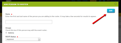
- We added a "Save" button at the top of every "Add person to roster" and "Edit" popup so that it is quicker and easier to save a record if only the top few fields must be completed for the add or edit to be complete (i.e. you don't have to scroll down to "save" this way).

- Leaders may choose whether to receive an email every time a person registers or if a person's registration status changes for their activity. You'll find this on the "Registration" tab when scheduling or editing an activity:

My Profile
- When you edit your profile, you've got a wider form because we hid the unnecessary left navigation column.
- The list of "Primary Activities" and "Committees" on your profile page is now sorted alphabetically.
- When viewing your or anyone else's profile we now show the name of the person's profile being viewed in the top of the left navigation column. This prevents confusion if you frequently have to review many people's activities (e.g. evaluating course requirements).
- If you're viewing your own My Profile page, all of the items in the left navigation column start with "My" (e.g. My Activities). But if your viewing another person's profile page, we hide the "My" part (e.g. Activities). These two changes allow leaders and family members to more clearly identify whose information is displayed.
- We merged the My Purchases and My Recurring Payments pages into one My Payments page on your profile, and improved the "recurring payments" features and messages on that page. It should now be easier to manage paying your annual dues automatically and making automatic monthly donations.
Social Media
- We added meta data tagging functionality that makes images look much better when a link from our website is posted on Facebook and other social media sites.
 Jeff Bowman